The process of sketching ideas is challenging for many young designers. Most of them may say things like “I can’t draw” and “OMG, this is really hard. I spend countless hours on it, but it’s still not perfect.”. However, this isn’t the case. As a matter of fact, achieving a desirable result requires patience and wouldn’t happen on the first go around. Start drawing your ideas on paper immediately after deciding on them. Do not worry about the outcome because the goal is not perfection. In this post, I will show you the Messenger logo design process and show you how to get your desired result.
Before moving forward remember that you shouldn’t jump into software the moment you have an idea in your head, because there is a long way between an initial idea and the desired result. In fact, the outcome is much more different than the original idea. The two concepts are as different as night and day. It doesn’t matter how poorly or well you sketch your ideas, start with a piece of paper. Sketching is an effective brainstorming tool; it leads to new ideas. Actually, we are not trying to draw a masterpiece, but rather, we are just trying to find and evaluate ideas that are in our minds. When we put our ideas on paper, we are able to see how good or bad they are.
Here’s how I created the Messenger logo;
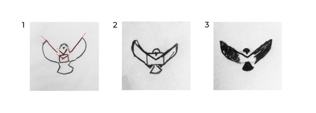
I have included three of my first sketches for this logo below. At the time, I had no idea how it would look. As you can see, I made incremental improvements to the mark.

The initial concept is like something a 3-year-old would draw. As you can see, it’s quite different from the final piece, but I did not quit. I knew if I hung in there long enough, it would improve. The lines with the same angel (highlighted) are visible in number 1 if we look closer. In this case, there are two options to reduce the number of lines; one is to remove similar lines and the other is to merge them. Number 2 shows how removing the V shape lines under the pigeon head and merging the wing and seal flap lines work. Certainly simpler, but not enough. Rather than having eyes, I removed them from the design since they weren’t necessary and their absence causes no problems. The logo should be as simple as possible, which is achieved by removing the parts that do not play a crucial role in the logo. Leaving out the tail and crest of a peacock, two of its most striking features, would be a big mistake because people know this bird with its distinctive features. If not, what’s the difference between a Peacock and a Pheasant. Everything is the same between them. As you can see, this is about their entire bodies, not specific details.
In number 3, I used shapes instead of lines because it is just as effective as several lines. For example, drawing a wing requires four lines, but it’s possible to do it with just one basic shape. Moreover, simplicity is beneficial. Moreover, the shape can be used to create negative space in logo design, which is very useful. It’s the simplicity of negative space marks that makes them so cool. And it is simple because few shapes are used, isn’t it? Going back to the Messenger mark, it is indeed simple. I now have a nearly clear image of the mark in number three, but there is a line to indicate the seal flap of a mail pocket, which should be removed since it doesn’t sit harmoniously with the rest of the mark. As it turned out, I had no idea how this was possible, and it happened during the process of the software executing.
When you have done some sketches and have an acceptable idea on paper, you need to jump into the software to create an exact logo.

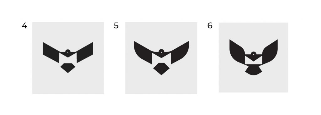
It’s time to convert our sketches into vectors in graphical software. Due to its sharp angles and corners, number 4 does not resemble a pigeon, but rather an eagle. It’s difficult to portray the natural shapes of a pigeon body, particularly a flying pigeon body. To deal with that, I need to look at my design in-depth and analyze it. In order to do this find an image that closely resembles your idea, then figure out what sets pigeons apart from other birds.

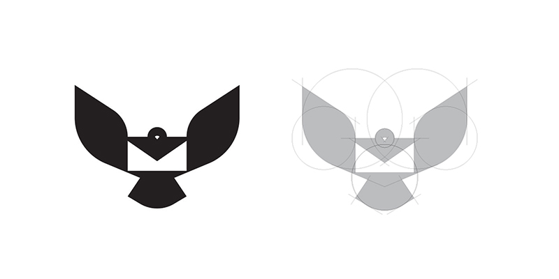
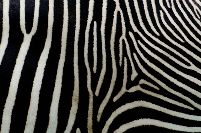
Here’s an image showing the wings had a lot of curvatures, compared to, say, an eagle, which has longer wings with a lot less curvature. Therefore, I tried to make it as close as possible to a real bird’s wing shape. Additionally, pigeons have semicircular tails. It is important to consider these things when designing your logo since they make all the difference. They are the keys to success. This is not magic, and it would not happen overnight. The more we design and create, the more skills we develop, and the more this happens subconsciously.
It took me a lot of back and forth to figure out the best way to implement the messenger mark. After trying various methods, I found the perfect cure and angel for the wings and tail. In addition, I tried several ways to have a mail pocket in the negative space. By adding those small components to the bottom, the mail pocket became more apparent. While in number 5, you can see that mail pockets do not come to mind easily.
While this is an important aspect we should consider, some parts of its body are essentially the same as other birds, so we can ignore them and keep things as simple as we can. Pigeons have a distinctive beak shape so I needed to consider this.
I suggested, however, you design your logo based on the natural shape of a bird’s body, though you shouldn’t be afraid to use your imagination. You own your imagination, and no one in the world thinks the way you do, which makes it possible to design a unique mark. Your imagination makes the difference. It helps you to find a new way of solving problems.

Okay, I showed you how I came up with my initial idea in the Messenger logo design process. The ideation process on paper is less restrictive and more creative than on screen. Using a piece of paper allows our hands and brains to work seamlessly together. So do not underestimate the power of ideation and sketching. The Messenger logo design process post is my first post about my design process. Of course, it’s not perfect, but I will make it better as time goes on. Your feedback is highly appreciated.
Also, I share the logo design processes on my Youtube channel, don’t forget to visit and SUBSCRIBE.

9 comments
Great Idea to share your design process, hope to see more 👍
Of course, I’ll share more as soon as possible. Thanks for your comment 🙏
Milad, I’m really glad you’re sharing your experiences because I’ve always envied the very good form of your works And now the reasonthis awesomeness is becoming clear
carry on man 🔥🤘
Thank you, my man. Truly appreciate your feedback and I’m so happy you like it. I try to do more like this. By the way, I’m gonna write an article about “Why a logo is identification”. Stay tuned 🔥
Thanks for sharing your GREAT experience Milad.
Hey Reza, Glad to see your comment. I appreciate your supports, Bro. ✌
Thanks for sharing design process ✌🏻
My pleasure Keyvan. Glad you like it. Thank you
Very interesting details you have mentioned, regards
for putting up.Expand blog