eXp is one of the world’s fastest-growing real estate brokerages. Founded in 2009, they are now in 24 countries around the world with a community of over 86,000+ real estate professionals, all connected through a unique cloud-based platform, eXp World. In this post you will read eXp Realty redesign story, the problem and solution. See the full case study here.
Exp introduces itself as the pioneer in the real estate industry. Their old logo was outdated; many elements were included, were not simple, and did not represent brand persona and characteristics.
Let’s see where the exp realty name comes from. Here is an explanation from Glan Sanford about the exp realty brand name:
Simply, eXp was chosen as the name by eXp World Holdings Founder and CEO Glenn Sanford and other leaders who started the company in 2009 because it is the prefix for many words that represent the values that eXp Realty stands for.
For example, words like “excellence,” “exceptional,” “expectations,” “exposure,” “experts,” “exploration,” “expeditiously,” and “experienced” are all positive words that support eXp Realty’s core values of integrity, community, service, sustainability, collaboration, innovation, being agile and lastly, fun!
They are one of the most well-known brokerages in the world. It’s important to keep the characteristics of the brand In the new design because they have many audiences around the world. Over the years, trust and loyalty have formed between them, and nothing is more important than the relationship between the brand and its audiences.
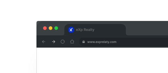
So in the new design, I tidied up the previous logo and removed the unnecessary elements like the house symbol and frame had been removed to have a modern and simple design that is compatible with the digital environment. The new logo has an X letter with a taller right hand representing the Upper case X in their name, which conveys a sense of pioneer and going beyond.
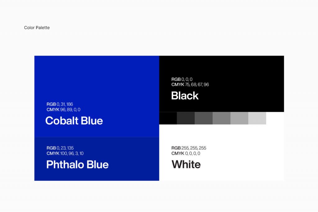
Just dark blue color, which was the main color of the brand, changed a bit to be brighter, and this new color works better in RGB color mode. RGB is the color mode that should be considered more in branding design because electronic devices have overtaken paper mediums, and more users are in touch with brands through digital devices.

1 comment
Very superb information can be found on site.Raise your business