In this article, you will read about Ender Brand Identity Design Process, a gaming platform brand identity. A play-to-earn competitive gaming platform that helps kids build projects to earn real money and level up their skills. In this write, you will read about the design journey of the Ender brand. A play-to-earn competitive gaming platform that helps kids build projects to earn real money and level up their skills. You will see our challenges in designing a new brand identity.
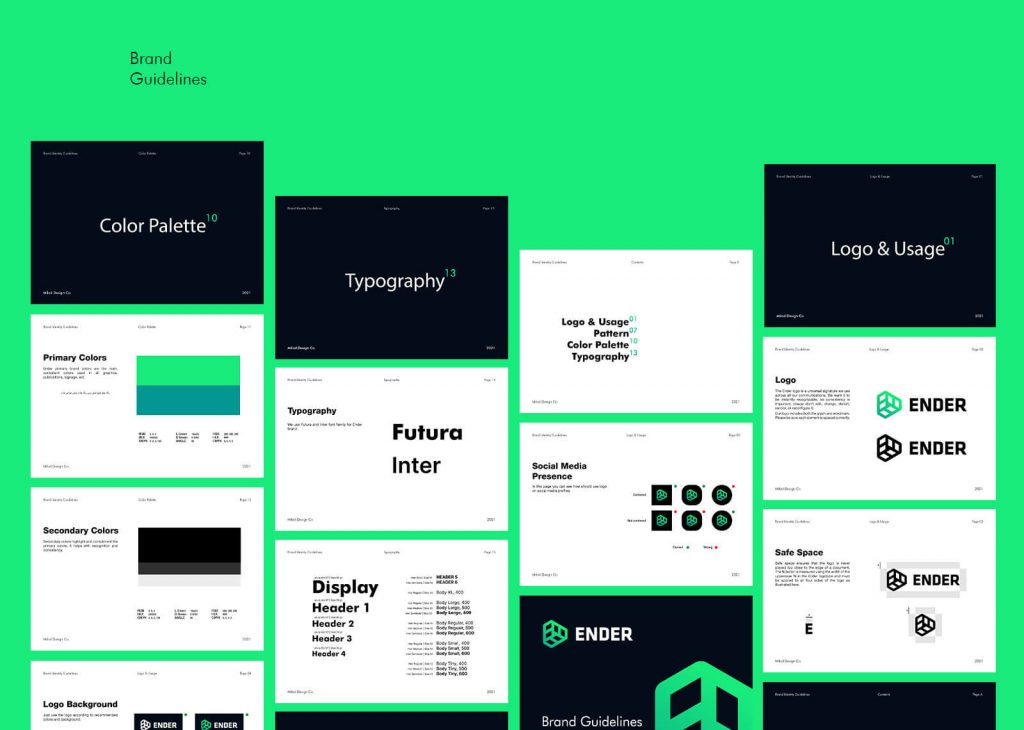
Logo Design
When we go through brand visual identity design, a logo is the first and the most crucial part. Analyzing the target audiences and market and the brand service and mission they stand for determine our design direction approach. Different options for logo design are available; symbols, wordmarks, etc. We have many options but have to try to choose the best fit.
When the client came to me to redesign their brand identity, they used to use a mark in which concepts had no comment on the business services and brand mission. Also, they needed a brand strategy. The need for a developed strategy could be long-term harmful to the brand. So I had to discover what the company stands for and how they want its audiences to remember them. I was responsible for extracting their brand values and mission and defining their persona to create a solid basis for conducting the design process.
Playing and competing with the other players is the most enjoyable activity for every child. They would like to learn new things. I have a teenage nephew, and I saw how thirsty he is for playing video games. They want to be number one among other friends and play the best way to show their superiority. In this project, our target audience is kids; we have to give them what they like. However, Ender’s mission is to teach them and help them make money, but money and education couldn’t be a good motivation for a kid. So we decided to maneuver on the game and play concepts.
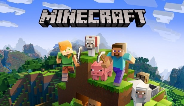
The concept I have developed was inspired by three things, the game, the brand name, and the service they offer. Since Ender helps their customers earn by playing Minecraft games, they have a website where kids can compete to build Minecraft structures; I had to design a logo that represents their business that is simple and appropriate enough to remember easily. So we worked on a combination of a play sign, the letter E, and the 3D shape of Minecraft blocks, a very well-known item among players. In this logo, 3 E letters joined together to shape a play sign.
We made a modern geometrical logo that works great on various platforms and devices. The logo is simple and easy to recognize in petite sizes. That’s why we decided to have a symbol.
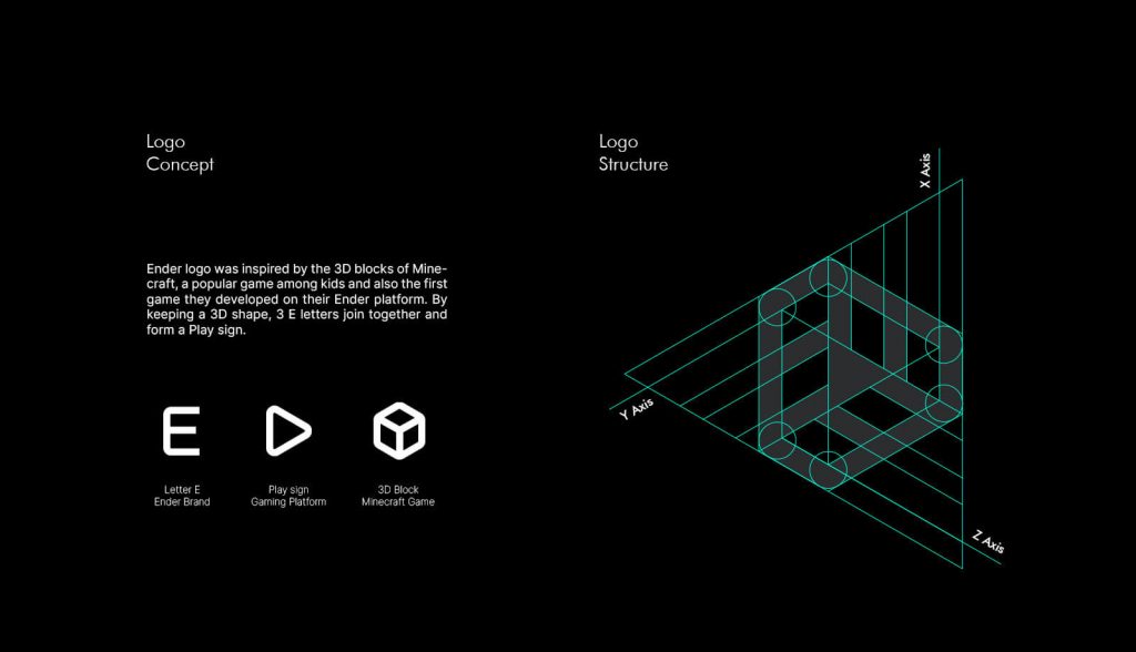
The new logo is inspired by business, and the target audiences have been considered in the research phase, so it’s more relevant to the company and will raise customer loyalty. I will talk about the colors and how it helps to have a distinctive identity.

Color Palette
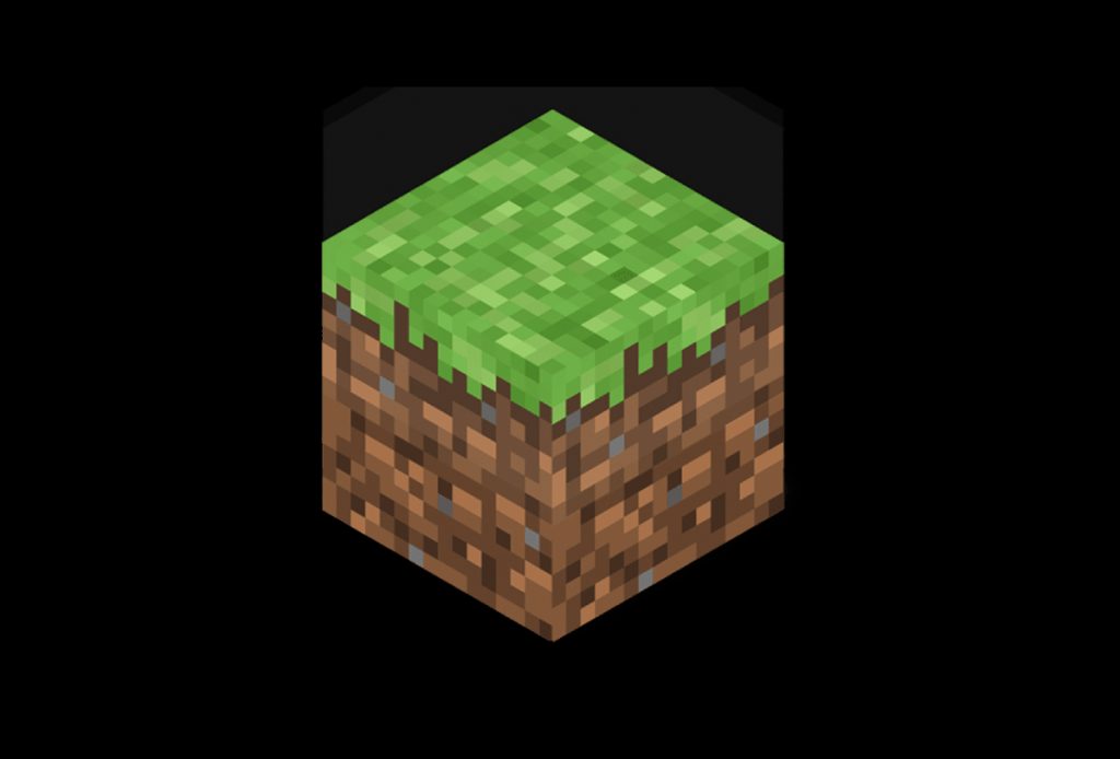
Designing a catchy and memorable visual identity requires integrity through all brand assets. Color plays an essential role in brand identity. In this project, brand colors are inspired by the colors of the Minecraft game. Green is the most recognizable color in this game, and a 3D block of land is a prominent part of their brand identity.
It is the designer’s responsibility to create the look and feel of the brand identity. The initial design decision should consider the product’s purpose and audience. Choosing the color scheme carefully is essential, as it will have a long-lasting impact.
Digital product designers may use a dark color scheme for various reasons, including conveying drama and evoking emotions or integrating branding with the design.
It has been found that dark user interfaces can reduce “digital eye strain.” Excessive computer use can lead to headaches, neck pains, blurred vision, and burning/stinging eyes.
Darker themes are also common in gaming app UIs. Black colors are more appropriate for the gaming context and the gaming environment. There is a sense of mystery, a sense of focus, and a sense of hierarchy when using a black background. Consider that we have a gaming platform in which images and videos are shown through, not text. So dark backgrounds are the best choice.
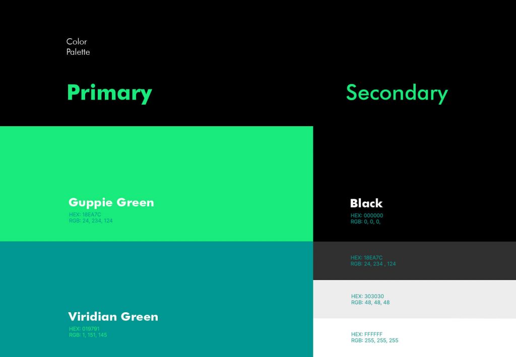
Brand Visual Elements
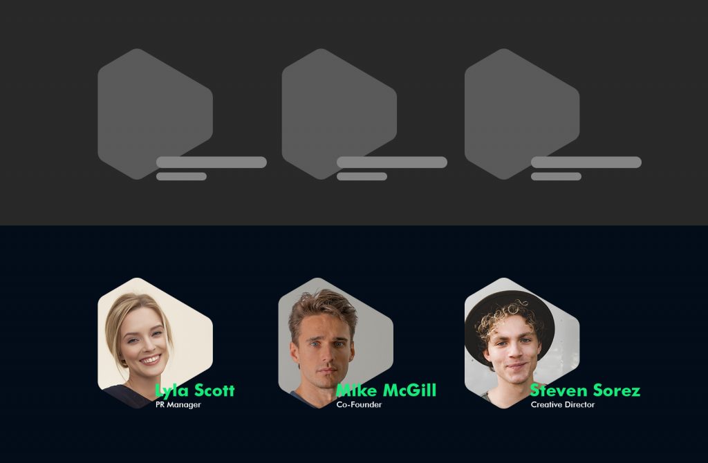
After designing the logo and picking the right colors, it’s time to create visual elements. Elements will go through every brand touch point and make coherence and cohesion in the whole brand. Shapes and decorative elements are all inspired by the logo. Here are some examples:
Here we use the logo shape as frames to use in UI, posters, identity cards, etc.
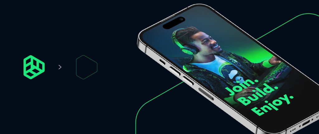
An outline shape is used to create a neon-like line to get used in the background behind other elements.
Typography
The typeface has been used for the heading is Futura. Bold weight is used for the slogan. Its bold, Modern, playful typeface motivates feelings and connects to the users.
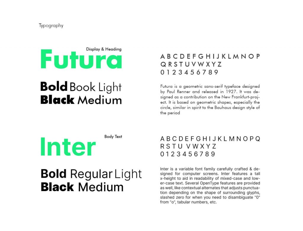
“Futura is a geometric sans-serif typeface designed by Paul Renner and released in 1927. It was designed as a contribution to the New Frankfurt project. It is based on geometric shapes, especially the circle, similar in spirit to the Bauhaus design style of the period. The design of Futura avoids the decorative, eliminating nonessential elements, but makes subtle departures from pure geometric designs that allow the letterforms to seem balanced. Futura has an appearance of efficiency and forwardness.”
For the body text, Inter is our choice. Inter is a variable font family carefully crafted & designed for computer screens.
“Inter started in late 2016 as an experiment to build a perfectly pixel-fitting font at a specific small size (11px.). Because of the pixel-aligning nature of that approach, the font took an almost mono-spaced appearance, making it easy to read numbers, punctuation, and concise words, but eye-straining to read anything longer.”
• Check the entire case study on Behance
• If you need any help with your business branding, contact me.
1 comment
Hello there, just became alert to your blog through Google, and found that
it is truly informative. I am gonna watch out for
brussels. I will appreciate if you continue this
in future. Many people will be benefited from
your writing. Cheers! Escape room lista