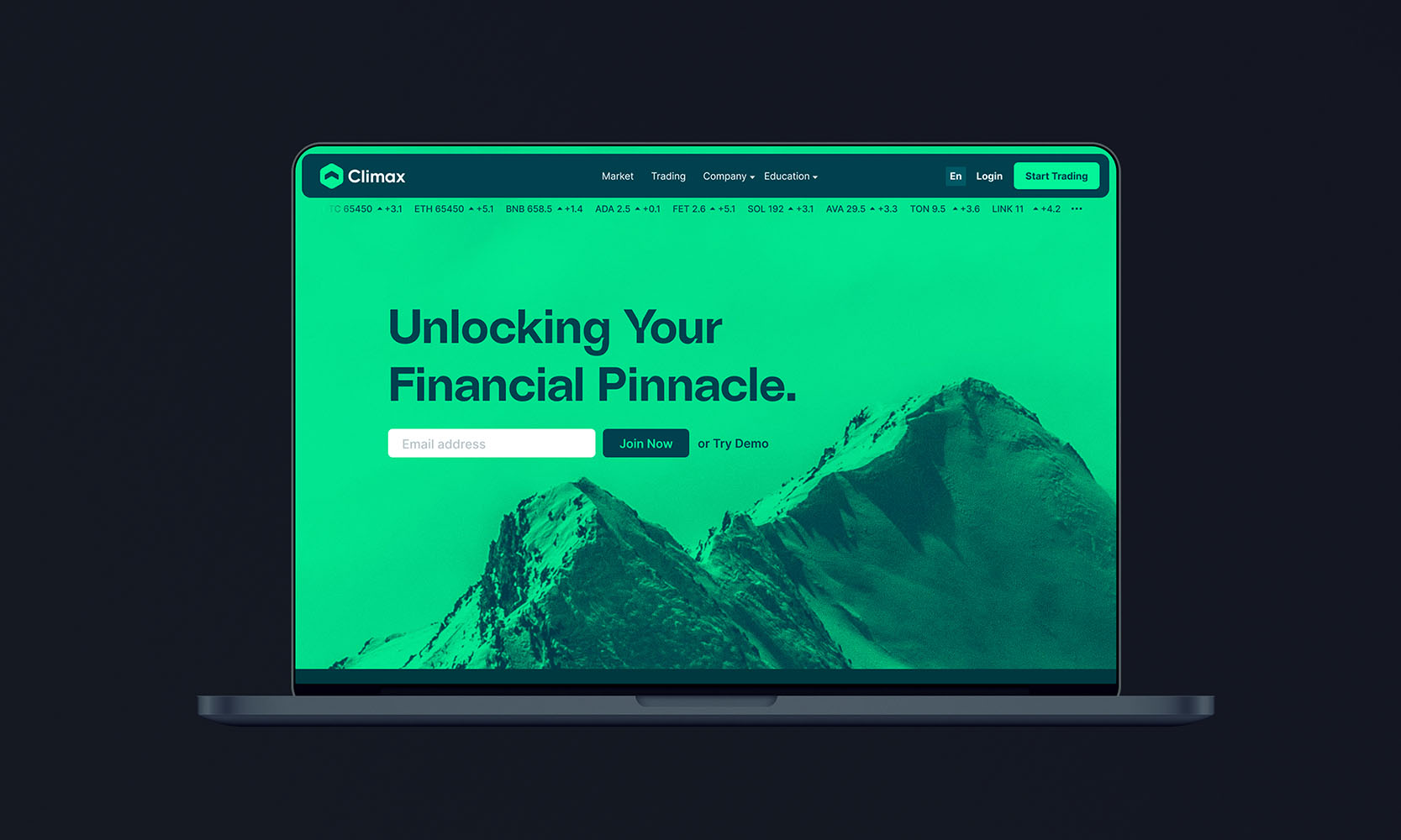
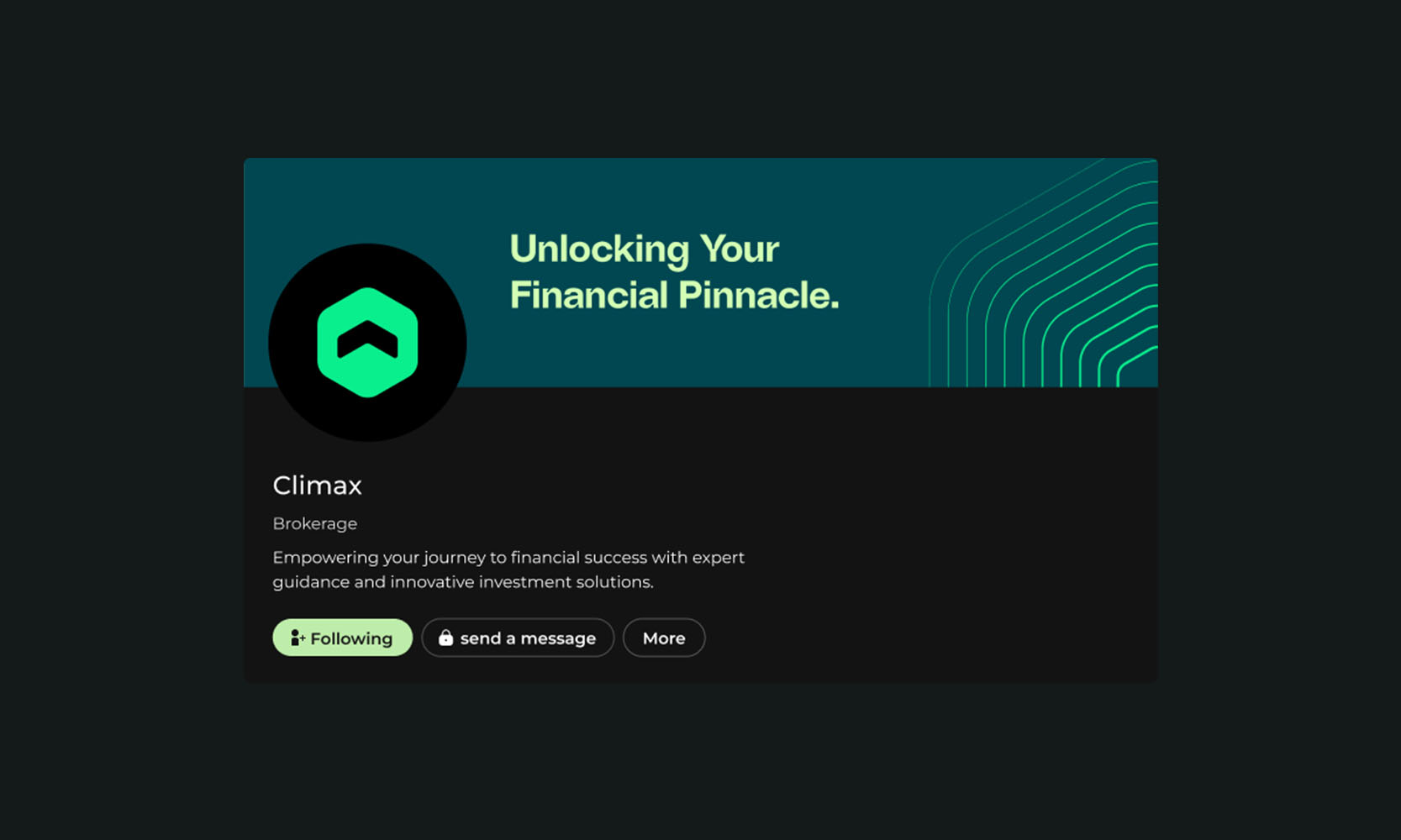
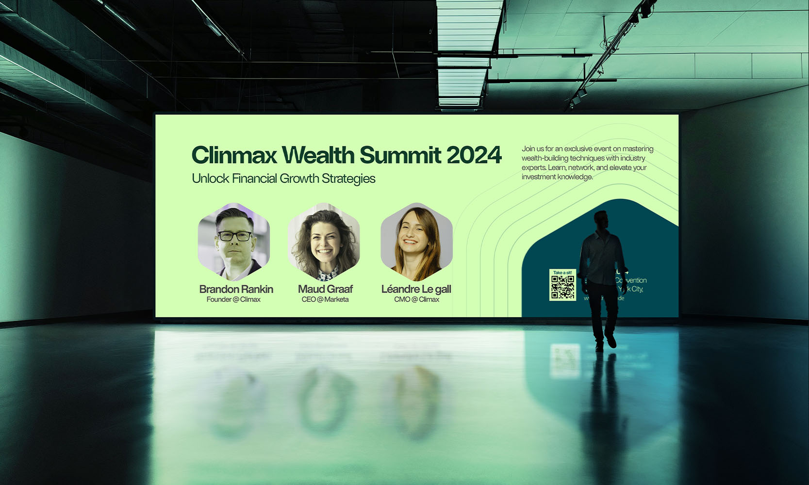
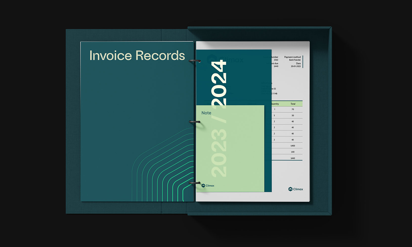
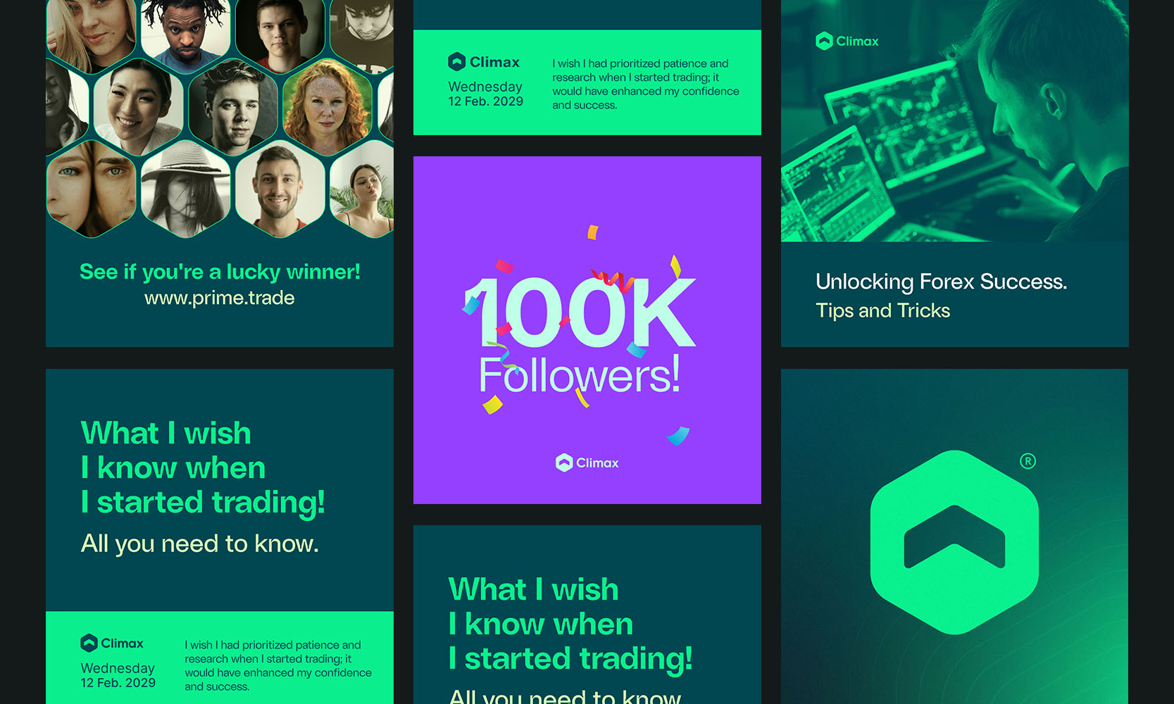
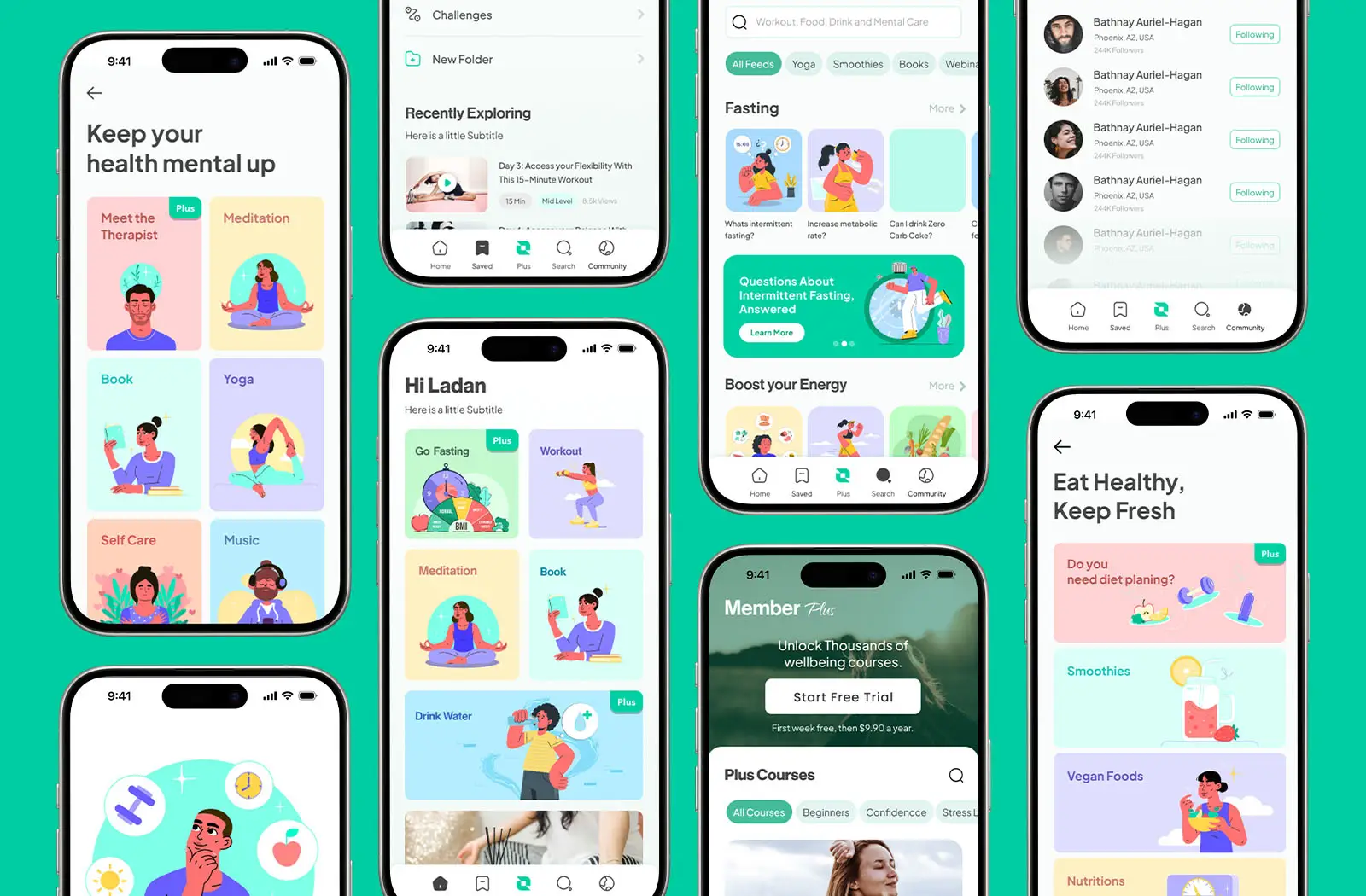
The Climax brand identity project centers on creating a modern, bold, and professional image for a brokerage firm. Reflecting the brand’s name and values, the identity captures the essence of Climax, where everything builds up to a peak. Through sleek typography, a refined color palette, and dynamic design elements, the brand identity visually embodies this powerful meaning. It conveys trust, sophistication, and clarity, representing Climax’s commitment to guiding clients toward their financial high point.
01. Challenge
Building a Brand From Zero
Climax entered the market as a new brand with no existing visual identity. The main challenge was to create a logo and brand system that could define the brand from scratch, communicate professionalism, and feel credible to traders and stock market professionals.
Without any prior visual references, the identity needed to establish clarity, unity, and trust from day one while standing out in a competitive, fast-moving financial space.
The solution was to design a minimal and futuristic brand identity that reflects precision, confidence, and forward thinking. A clean logo paired with a cohesive visual system created a strong foundation for Climax, allowing the brand to appear unified, professional, and reliable across all touchpoints.
The restrained design language ensures focus, scalability, and long-term relevance—positioning Climax as a modern brand built for serious traders and stock market professionals.
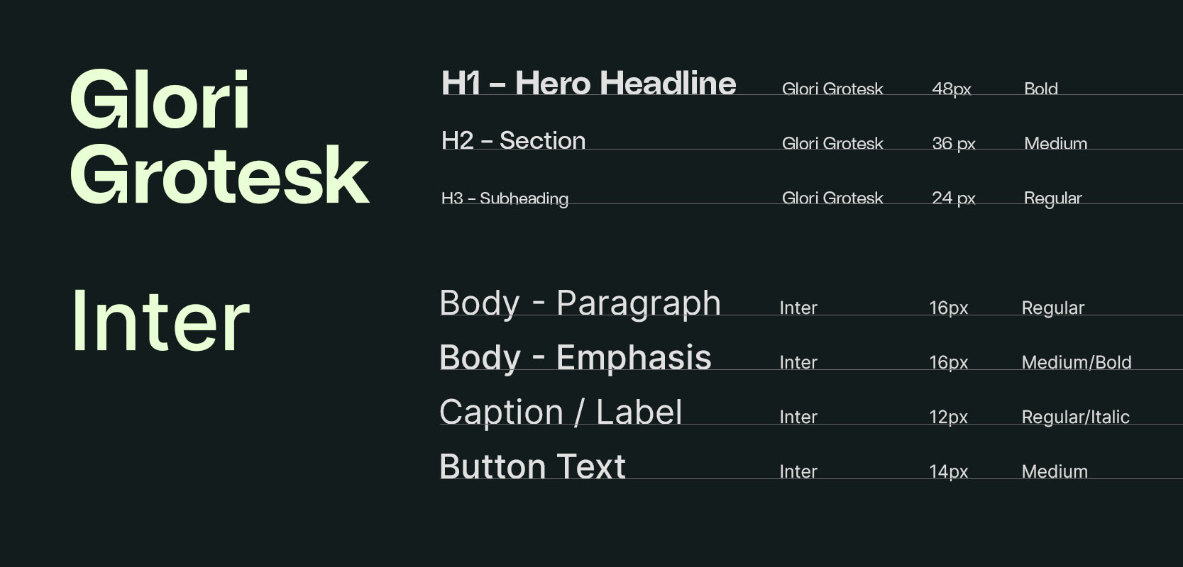
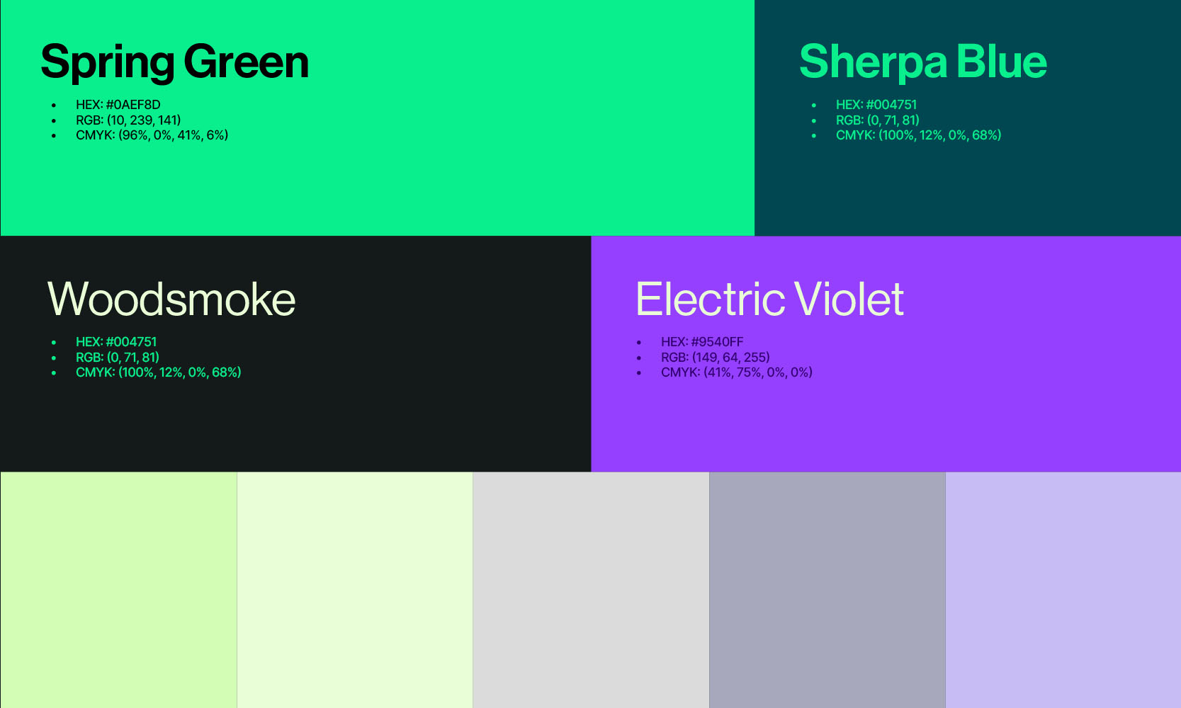
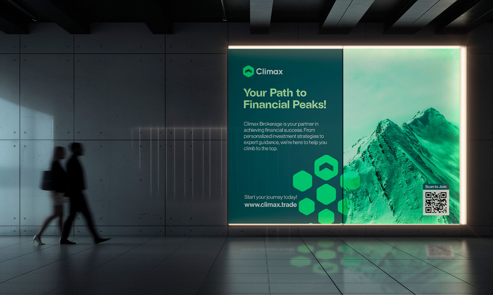
A modern and bold brand identity designed for Climax Brokerage, inspired by the idea of reaching the peak. Through refined typography, a sleek color palette,…
We would love to hear from you
Say hi
Tell us about your project.
Let's collaborate and make
some great stuff together.